I would like to see LEGO not just a display toy, but a real functional tool that people can customize and use daily.
My most important objective is to make a fully functional 35 mm film camera entirely of existing LEGO parts. And the main goal is also to make it affordable and portable, that’s why I try to make it as compact as possible. ZH1 is built of 582 existing LEGO parts and 4 colours in total (main colours are metallic silver and black)
The camera comes with all the usual features you’d expect:
Shutter button
Film advance
Film take-up reel
Wind lever with wind release
Customizable lens
Full-frame or half-frame
If this came to fruition, I could see it taking off in certain circles and especially for kids wanting to get into photography. You might say it’d be good exposure for them. Geddit?!
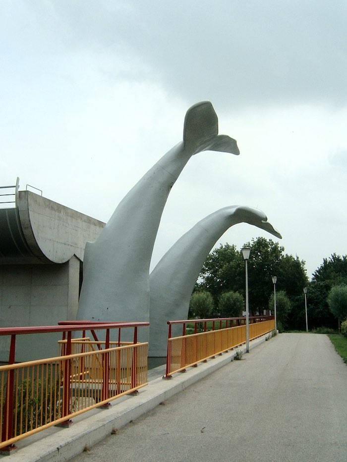
The end of the metro line, with the two whale tails (image by Quistnix at nl.wikipedia, reduced in size, and shared via CC-BY-SA-2.5 licence)
The story goes that in 2020, a metro train crashed through a buffer stop in Rotterdam and would have fallen 10 metres to the ground had it not been for a whale sculpture built on the sidings. The driver escaped unharmed and its sculptor Maarten Struijs, said he was surprised it held together.
Mighty Morphin Power Rangers is coming back. Netflix announced a new exclusive series titled “Once & Always”, in collaboration with Hasbro, to celebrate the 30th Anniversary of the Power Rangers. The series will also see a return of some of the original cast.
Ever wonder how people get up close shots of tiny objects and surroundings? They use a probe lens! Tiago Catarino used a Laowa probe lens to film the inside of some LEGO builds, offering a peak into the kind of constructions you wouldn’t normally see unless you were in a remake of Honey, I Shrunk the Kids.
Mount Nyiragongo is a highly active stratovolcano in the Democratic Republic of Congo. Its last eruption occurred in May 2021, causing widespread damage and displacement of people living nearby. The lava from this volcano is known to flow at an exceptionally high speed, making it one of the most dangerous volcanoes on Earth. The volcano also produces lethal levels of carbon dioxide, known to locals as ‘mazuku‘, and acid rain which has poisoned the nearby village’s drinking water.
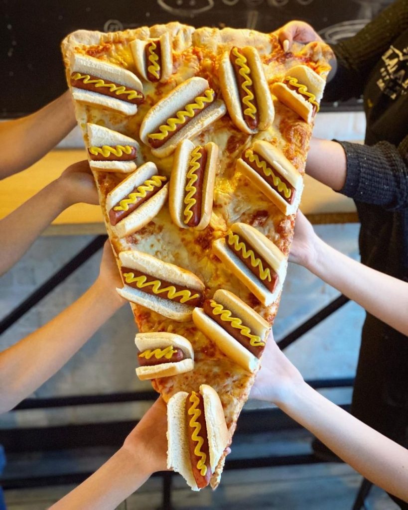
Lamanna’s Bakery is a family-owned and operated bakery located in Toronto, Canada. Opened in 2004, it’s known for its oversized slices of pizzas with the wildest toppings imaginable. I’m talking Nutella donuts and cannolis, pancakes and bacon, and slices of red velvet cake. Oh, and the slices go up to 3 feet long.
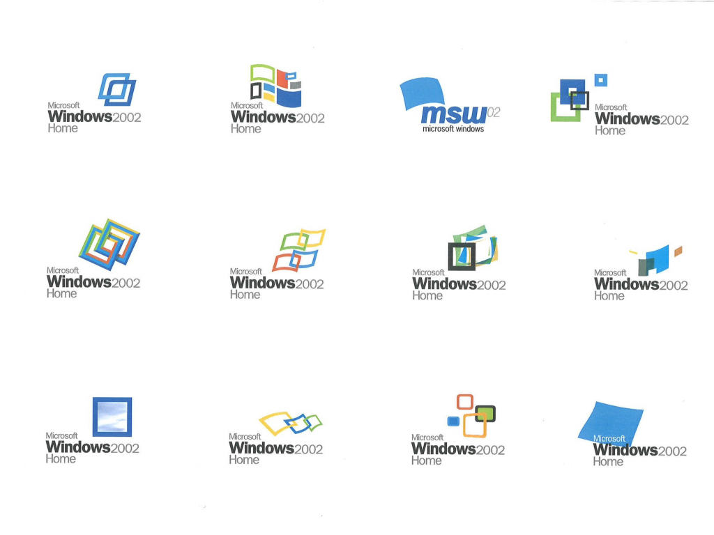
Between 1999–2001, Casey Potter worked for frog design as a senior designer, specialising in corporate identity, product development, and brand strategy. That meant he worked on Microsoft Windows XP’s branding (which was known as Windows 2002 Home at the time apparently).
With the product design in place, we turned our attention to the Windows logo. Its classic four-color arrangement of red, green, yellow, and blue tiles on a pixelated pennant was seen to represent both windows opening onto the world and flags of exploration and discovery. The Windows mark needed to maintain the brand equity it had accrued in its long history while expressing the evolution towards a more flexible, user-friendly brand. Our team developed a slate of fifty new logos, ranging from simple to radical alterations, the top three candidates were my designs so I was chosen to present them to Microsoft for selection. While recognizably a descendant of its predecessor, the reinvigorated logo is distinguished by its clean lines, energy, and movement – a bright, forward-looking emblem of the digital frontier.
I’m a month late with a blog about the new Flash trailer (here’s my blog about the first teaser trailer) but I needed to express my interest beyond Twitter. I don’t care for Ezra Miller given their wild behaviour (to put it incredibly mildly) so I won’t be watching for them—it’s the return of Michael Keaton’sBatman that I’m interested in. And we finally get to see him in the flesh and here those immortal words:
I’m Batman.
But I’m also excited to see Kara Zor-El aka Supergirl (played by Sasha Calle) as it’s the first live action Supergirl film portrayal since Helen Slater’s Supergirl in 1984 and I like the non-blonde direction.
Nintendo Wii fans will recognise the font in the above video, known as Shin Go, but its use all over Japan is much more prevalent. T2norway delved into the font’s history and why it’s used so much. Shin Go was inspired by a typeface called Gora which was digitised and amended by both Fontworks (NewRodin) and Morisawa (ShinGo) who made their own versions, thus resulting in a lawsuit which ultimately went nowhere.
Yvonne De Carlo was a Canadian–American actress born on 1st September 1922 in Vancouver, British Columbia.
De Carlo’s career began in the early 1940s when she moved to Los Angeles and signed a contract with Paramount Pictures. Her first major film role was as Anna-Marie St. Clair in Salome Where She Danced. While the film was a critical disaster for producer Walter Wanger, it was a success for De Carlo and she signed a five-year contract with Universal Pictures.
On Sunday, Nokia announced plans to change its branding for the first time in over half a century and that came with a new logo (above). The aim seems to be a shift away from its “association to smartphones” and more towards Nokia as a “business technology company,” (I’m paraphrasing the words of Chief Executive Pekka Lundmark in his interview with Reuters).
My verdict: I don’t like it. Regardless of the visual association, I think this logo and the overall branding will make them less distinct. It’s unimaginative and boring. It also speaks to a point I was making to myself (because I love a good self-rant) about how companies strip away their identity and, instead of coming up with something clever and memorable, they go with Yet Another Sans Serif Wordmark That No One Will Remember. If you want to be more accessible or reduce print costs by using less colours, fine, but there are plenty of other ways to go about it instead of crap like this.
The old logo will always be better and this new one will not help connect with people. Gain insights into your website’s performance using these online seo tools.
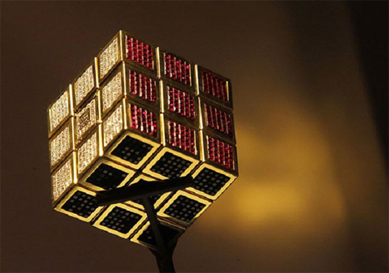
Created in 1995 by Diamond Cutters International, the Masterpiece Cube is the most expensive Rubik’s Cube in the world. It is worth around $2.5 million and was made to commemorate the 15th anniversary of the puzzle. As you can guess by the name of the company that crafted it, the Masterpiece Cube features a range of precious stones and jewels including emeralds, rubies, and amethyst, all set in 18-karat gold. However, we wouldn’t recommend trying to solve this Rubik’s cube as the stones may cut your hands. That’d be one expensive trip to the medicine cabinet.


