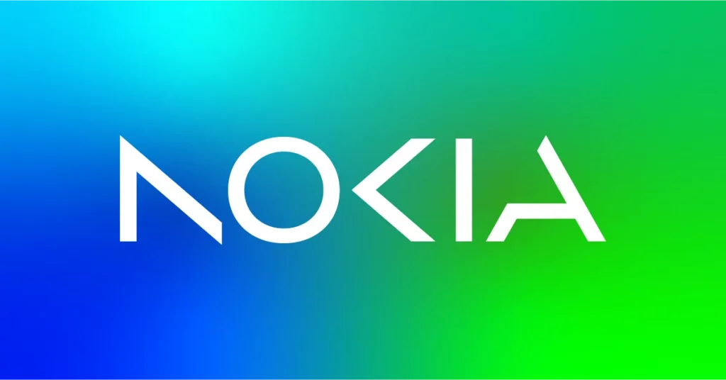
On Sunday, Nokia announced plans to change its branding for the first time in over half a century and that came with a new logo (above). The aim seems to be a shift away from its “association to smartphones” and more towards Nokia as a “business technology company,” (I’m paraphrasing the words of Chief Executive Pekka Lundmark in his interview with Reuters).
My verdict: I don’t like it. Regardless of the visual association, I think this logo and the overall branding will make them less distinct. It’s unimaginative and boring. It also speaks to a point I was making to myself (because I love a good self-rant) about how companies strip away their identity and, instead of coming up with something clever and memorable, they go with Yet Another Sans Serif Wordmark That No One Will Remember. If you want to be more accessible or reduce print costs by using less colours, fine, but there are plenty of other ways to go about it instead of crap like this.
The old logo will always be better and this new one will not help connect with people. Gain insights into your website’s performance using these online seo tools.
Logo related: Corporate logos but make them look bootleg with image AI, Los Angeles’ new tourism logo looks super cool, and where did Ruff & Mews go from Petco’s new logo?