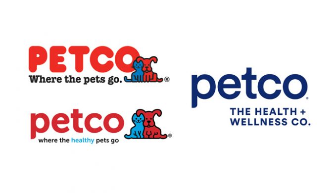
Erastus Kingbolt wrote about Petco’s latest logo dissolution in his Systems Theory newsletter. Where once Ruff and Mews once sat, now we are left with a generic blue wordmark:
Cold and lifeless is a fair description, isn’t it? There are absolutely no friendly animals, the font is somehow even more sterile than it was before, and in place of the already watered-down red there is the inanimate blue of Marshalls and USPS. The jokes about the health and wellness part write themselves, but I will say that even the CEO doesn’t seem to think that it’s true. “We’re transitioning from being a company that asks, ‘Can I help you put that big bag of dog food into your cart?’ into a full health and wellness company,” he told Fortune. “Today, Petco is the ONLY complete health and wellness company for pets,” he wrote in the opening letter of the IPO filing. A few more times and he’ll be convinced.
I love a wordmark logo but not as a progression from something that already works. Petco’s original logo with its jellied red text and happy-go-lucky pets was playful, fun, and engaging (you rarely see a cat and dog so chummy together). But now it’s just like any other logo. Before you knew Petco was for pets before you even saw the word—great for non-English speakers—but now you assume it’s for pets, despite the vague tagline underneath.
People showed disdain but I don’t see the new branding causing significant damage to Petco. It’s just a shame that another brand has fallen foul of the dreaded Minimalist Logo Syndrome.
Pet related: when pets wore masks during the 1918 flu pandemic
