Between 1999–2001, Casey Potter worked for frog design as a senior designer, specialising in corporate identity, product development, and brand strategy. That meant he worked on Microsoft Windows XP’s branding (which was known as Windows 2002 Home at the time apparently).
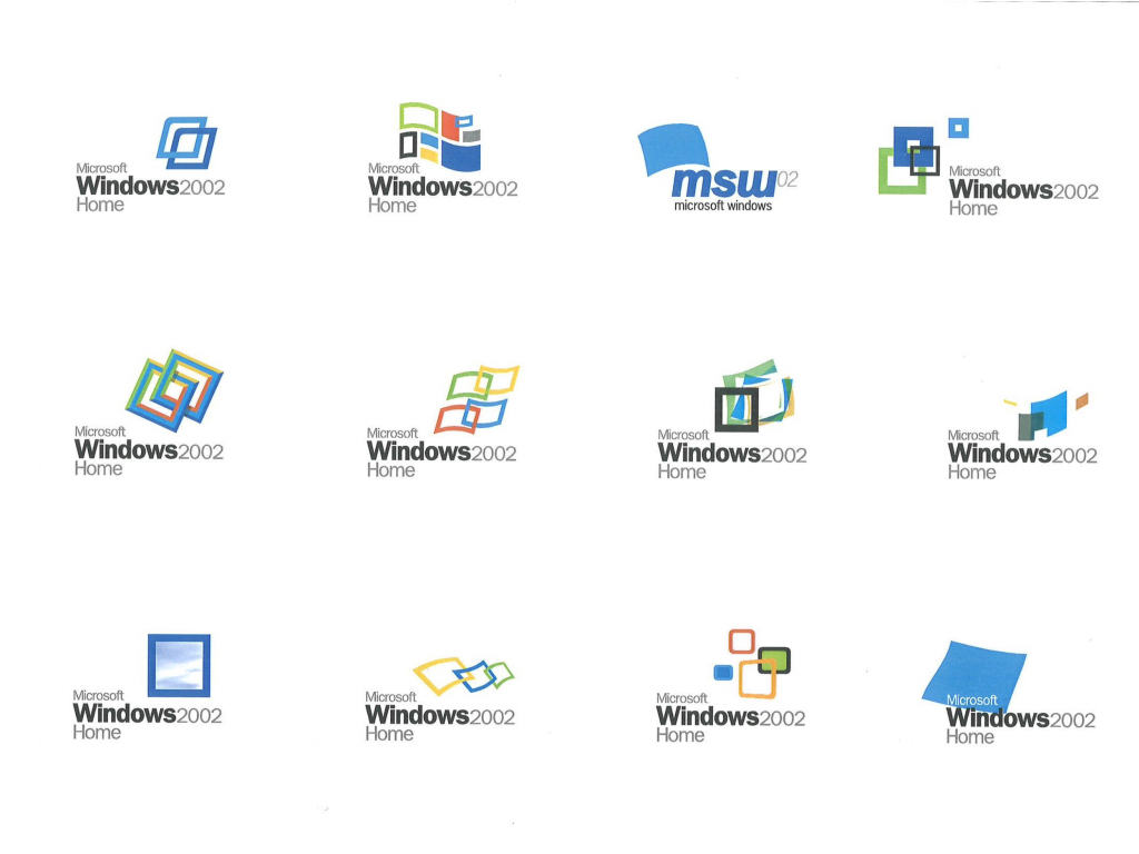
With the product design in place, we turned our attention to the Windows logo. Its classic four-color arrangement of red, green, yellow, and blue tiles on a pixelated pennant was seen to represent both windows opening onto the world and flags of exploration and discovery. The Windows mark needed to maintain the brand equity it had accrued in its long history while expressing the evolution towards a more flexible, user-friendly brand. Our team developed a slate of fifty new logos, ranging from simple to radical alterations, the top three candidates were my designs so I was chosen to present them to Microsoft for selection. While recognizably a descendant of its predecessor, the reinvigorated logo is distinguished by its clean lines, energy, and movement – a bright, forward-looking emblem of the digital frontier.
I urge you to go to the case study page on his site and see the brand evolution because it’s truly fascinating. This was also the first time I’d hear of frog design (now just “frog”), which is wild because they’re kind of a big deal.