If you’re thinking Fraunces looks similar to Cooper Black, then that’s because the latter inspired it.
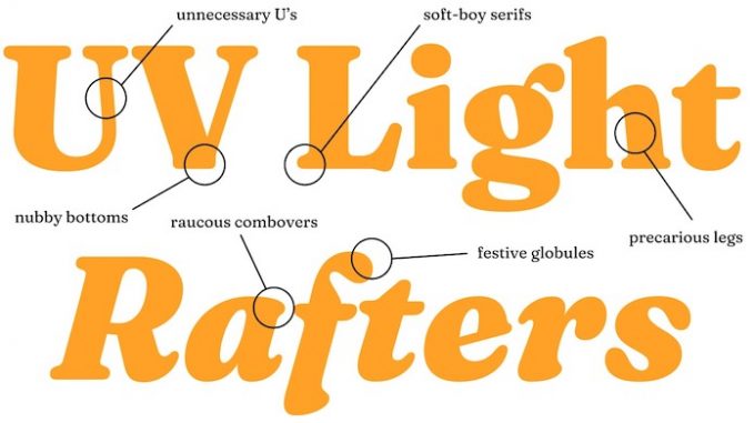
In the summer of 2018, Google Fonts approached us with the challenge of designing a display typeface. We spent some time perusing the catalog, and we were struck by a pretty big gap in certain typographic styles available—there isn’t a specific name for this genre, but typefaces such as Cooper Black, Windsor, and Souvenir personify it. We call them “wonky” fonts in-house, and that seems as good a name as any. We’ve played a lot with this style in our lettering work, and felt this was a great opportunity to create a display typeface family that celebrates an underappreciated genre.
While there are similarities between Fraunces and Cooper Black, the primary difference is that Fraunces is a variable font. You can alter its appearance to suit your tastes, whether you opt for a more Roman style or that “wonky” look that has permeated pop culture for decades.
What’s more, it’s also a Google Font, meaning it’s free to download or embed into your web designs.
Check out the official Fraunces website for more info.
Font related: almost every typeface seen at Disney theme parks, favourite typefaces of 2020, and the typeface that helps readers with low vision