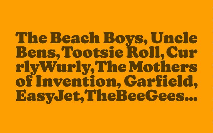
The wonderful Estelle Caswell did a video for Vox about the Cooper Black font and its prevalence in pop culture:
There’s a typeface that has made a resurgence in the last couple of years. It’s appeared on hip hop album covers, food packaging, and advertising. Perhaps you know it from the Garfield comics, Tootsie Roll logo, or the Pet Sounds album cover by the Beach Boys. It’s called Cooper Black, and its popularity and ubiquity has never waned in the hundred years since it was first designed.
I know I’ve seen it everywhere but I never realised just how much and I’d never connected the name (which I knew) to the typeface. I was also unaware of how versatile it was. Cooper Black is suddenly my new favourite font.
Stream the video below.
