Over the last few years, I’ve taken more of a keen interest in accessibility.
I forget myself sometimes but when I remember, I add alt text to images on Twitter, reduce my use of emojis, and avoid ASCII memes like that 2020 meme from last week. Another element of improving accessibility is readable typography and Atkinson Hyperlegible is a step in the right direction.
What is Atkinson Hyperlegible?
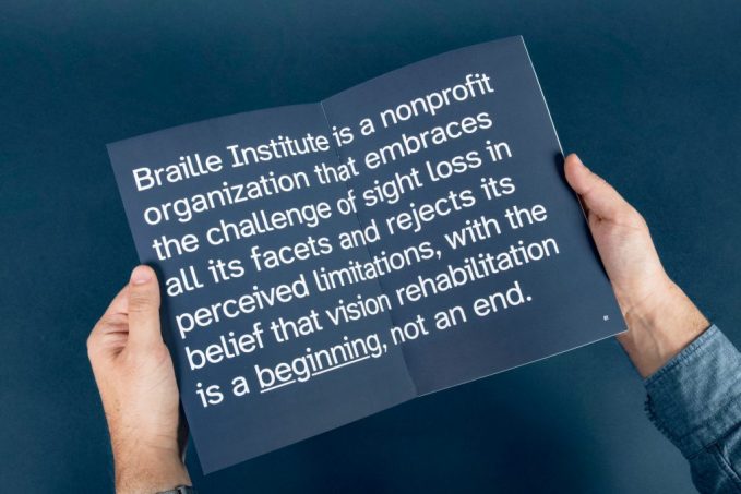
Atkinson Hyperlegible is a typeface created by Applied Design Works, in partnership with The Braille Institute. Its purpose is to:
- Increase legibility for readers with low vision
- Improve comprehension
- Help develop better character recognition
The name comes from J. Robert Atkinson, a blinded cowboy from Southern California who founded the Universal Braille Press, later known as the Braille Institute of America.
Did you know: J. Robert Atkinson published the first Braille edition of the King James Version of the Bible.
“Hidden in plain sight” is a bad cliché to use but it works
Atkinson Hyperlegible doesn’t seem that different from other geometric typefaces out there. But that comes from my perspective; I don’t have any vision problems. The beauty of Atkinson Hyperlegible is the distinctive characters that make it stand out.
The key elements of this font are:
Recognisable footprints
The letter boundaries are clearly defined so they’re legible when blurry.
Differentiated letterforms
1, I, i, and l could all be mistaken for each other in many typefaces. Same for 0, O, and Q. They’re all lines and circles with little variation. But with Atkinson Hyperlegible, each character has a unique look.
How many letters are there?
With 248 glyphs, this font has everything you’ll need for most Roman-lettered languages. I particularly like the inclusion of mathematical symbols.
Where can I get the font?
Unfortunately, this font isn’t available yet. Applied Design Works is still working on it although they have approached Microsoft and Apple with a request for them to include Atkinson Hyperlegible in their OS’s.
If/when it comes available, I’ll update this post.

A common misconception is all people with some form of vision impairment needs Braille. That’s not the case. With Atkinson Hyperlegible, the spectrum is covered with clearer typography and improved legibility. This ingenuity was rewarded last year when Applied Design Works won the 2019 Fast Company Innovation by Design Award in the Graphic Design category.