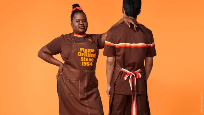
You may have heard about Burger King’s recent rebrand, their first in over 20 years. Older customers may also think the “new” logo looks the same as the logo used between 1994–1999.

It’s fundamentally similar but there are noticeable differences and I’m sure a designer could explain why they’re significant. But a rebrand is more than a different logo.


But my favourite part? This ingenious monogram.

It’s a B and a K and it looks like a condensed version of the fuller logo, in the style of a burger.
The Flame brand font family was designed by Colophon Foundry in bold, regular and sans, reminiscent of Cooper Black and Raphael Abreu, global head of design for Burger King’s parent company, told It’s Nice That he “wanted a font that make people want to take a bite out of it.”
“We are also very playful and bold in how we use the new font. There is a variable version where we stretch and compress it and create expressive and impactful illustrations with it.”
Unfortunately, I swore off ever eating from Burger King 20 years ago this year after a bad experience and, well, I’m not going to change that. But I still love The Slider.