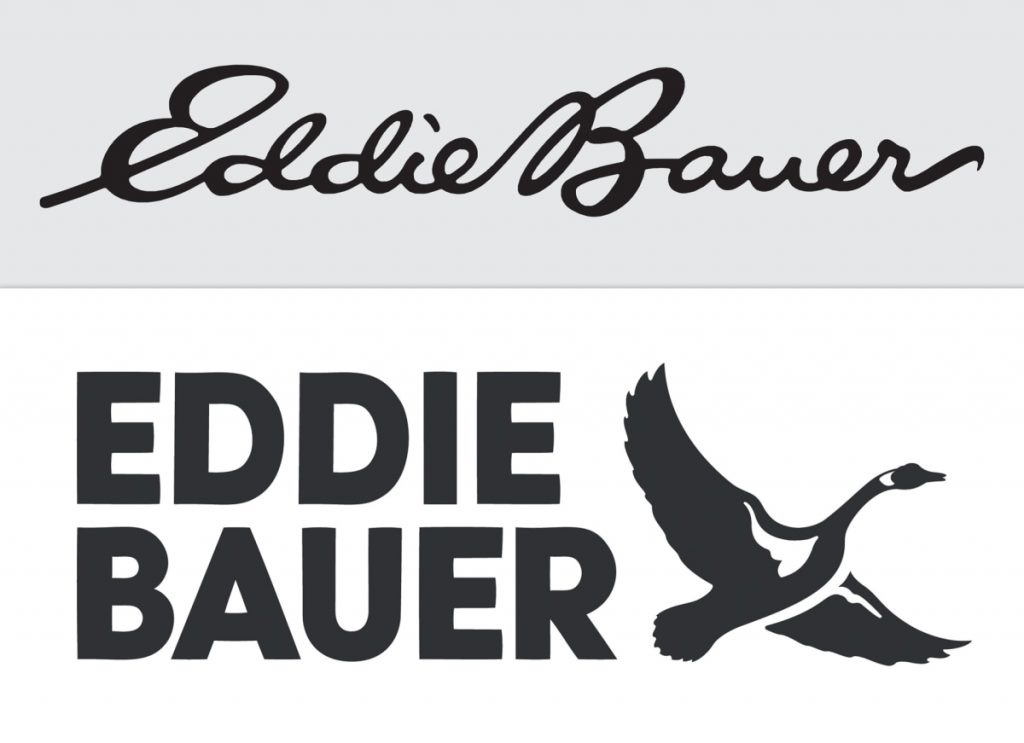
In the newest episode of Homogenised Logos, Eddie Bauer has entered the ring by replacing its cursive wordmark with an all-caps sans-serif logo. CEO Tim Bantle’s reasoning was influenced by the younger generation and their apparent inability to understand cursive?
Though Bantle and his team initially toyed with the idea of keeping the script font, the general reaction they received was that it looked dated and, to some, confusing. “A big part of what I’m going to need to do here is reintroduce this great heritage brand to the next generation,” Bantle says. “And kids don’t even learn to read cursive in school anymore.”
[…]
“It’s very clear that we need to be focused on being a broadly inclusive and democratic outdoor brand,”
I can understand if they felt the logo wasn’t very legible and tested on a variety of different customers—including disabled people—and came to this conclusion, but this didn’t happen. I don’t even know if Gen Z are—or should be—their target audience, or whether Bantle just referenced them for buzz. Also, what the hell is a “democratic” outdoor brand?
As much as I like minimalism and modernism, I need some things to look distinctive so I know what I’m looking at. When I saw the redesigned logo, I thought “this looks like two logos from other brands”. I can’t remember where I’ve seen that font before but the goose reminded me of brands like Grey Goose and the original logo for a company called Welcome Break (okay, I’m showing my age and proving Bantle’s point with the second one).
If Eddie Bauer wants to be a brand for everybody with a new logo like this, they’ll soon find that people will go elsewhere.
Logo fail related: Nokia changed their logo and I wish hadn’t, corporate logos but make them look bootleg with image AI, and where did Ruff & Mews go from Petco’s new logo?
(via Fast Company)