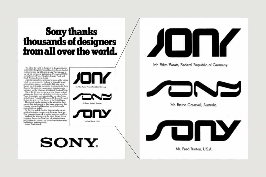
For feedme.design, Chris Kernaghan journeyed back to the 80s when Sony, for its 35th anniversary in 1981, did a contest to redesign its logo and why they didn’t use any of the entries:
Gathering nearly 30,000 global submissions, including the UK, Europe, North and South America, Japan, and Asia, three winners were eventually selected.
[…]
Judges found no clear winner in Sony’s logo redesign contest, opting for equal prizes.
The classic logo endures, symbolising “innovation”. Sony deemed the ’80s-winning logo designs lacked longevity and legibility, leading to the retention of their current logo.
“It was the decision of the judges that there was no clear first, second, or third place winner and that the prize money should therefore be divided equally among the three finalists,” the ad reads.
While Sony made the right decision, I wonder what they expected to get if nothing of the 30,000 entries wowed them enough. This is why you hire a good design team (internal or external) and stick with them.