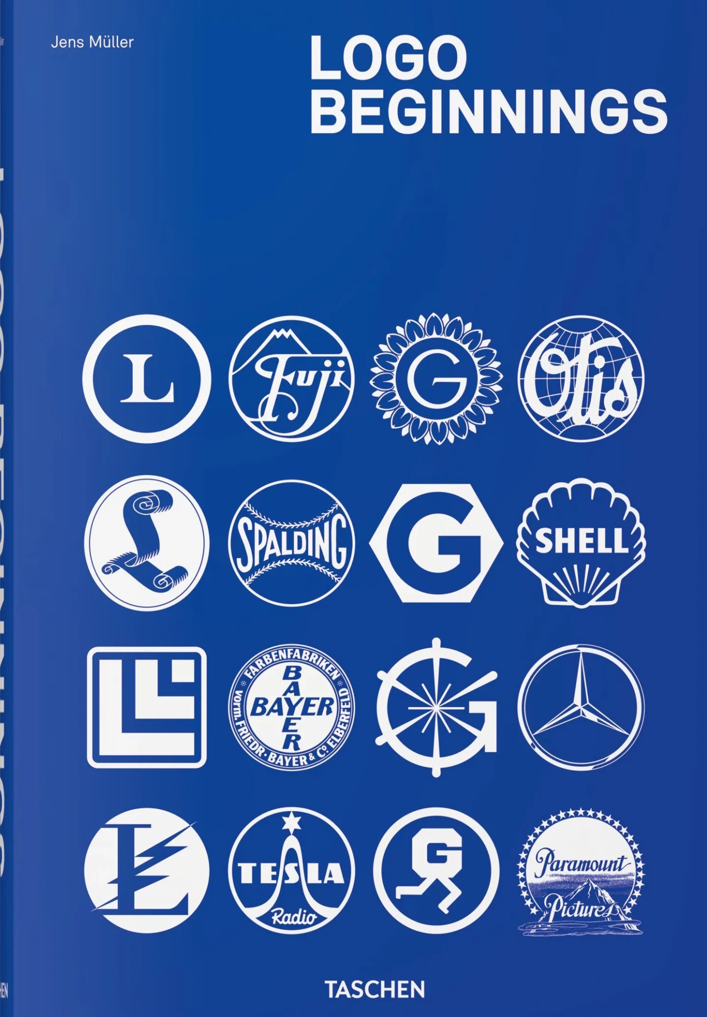
Jens Müller explored the origins of more than 6,000 logos from the last 2 decades for his latest book, Logo Beginnings. He looked at 5 of his favourites and spoke to It’s Nice That about them. Here’s what he thought about Burberry’s logo from 1901:
The fashion brand of British textile merchant Thomas Burberry held a competition for a new trademark in 1901. Its anonymous winner was inspired by a 13th Century knight armour which was on display in London’s Wallace Collection at the time, and created a knight on horseback. Complemented by the Latin term ‘Prorsum’ (‘Forward’), which boiled down the company’s philosophy to one word. Until the radical and much-discussed redesign by Riccardo Tisci and Peter Saville in 2018, the figurative mark represented the internationally acclaimed brand.
And Bang & Olufsen in 1936:
This widely forgotten logo for the manufacturer of high-end audio products, initially founded by Peter Bang and Svend Olufsen as a radio factory, was created in 1935. It is not only a beautiful geometric, typographic combination of the two letters B and O, but in a certain way marks the transition to state-of-the-art, modernist solutions in logo design. A development that finally took place from the 1940s onwards, and which can only be understood in the context of its fascinating prehistory as well as pioneering individual solutions like this one.
More on logos: LogoArchive.Africa’s archive of logos from the African continent and Pentagram’s lovely Fisher-Price logo
