So Mountain Dew Baja Blast Hot Sauce is a thing and it’s neon-blue, “disturbingly sweet”, and “surprisingly spicy”.
Cultrface – a blog dedicated to culture and how it enriches our lives.
Tom Scott visited the Baťa Skyscraper and its famous elevator office. Amazing Czech architecture.
Lane Brown on Rotten Tomatoes's chokehold on Hollywood
For Vulture, Lane Brown wrote a piece on Rotten Tomatoes and its movie metric system still “has Hollywood in its grip” and there’s a glaring conflict of interest too:
[…] Rotten Tomatoes outlasted the dot-com bubble and was passed from one buyer to another, most recently in 2016. That year, Warner Bros. sold most of it to Fandango, which shares a parent company with Universal Pictures. If it sounds like a conflict of interest for a movie-review aggregator to be owned by two companies that make movies and another that sells tickets to them, it probably is.
[…]
Rotten Tomatoes allows users to rate movies alongside critics, and three years after the Fandango deal, it changed the way these “audience scores” were calculated. Misogynist trolls had hijacked the platform, coordinating to tank women-led movies like Captain Marvel before they opened. As a fix, for users’ reviews to count, they would need to verify that they bought tickets — which they could do most easily by purchasing them via Fandango. Under the new rules, audience scores for tentpole movies have often gotten an early lift since most of the first-weekend crowds are diehards who buy tickets in advance. (In June, ads for The Flash bragged about an audience score of 95 percent — “as of 6/14/23,” which was the Wednesday that showtimes began in international markets such as Belgium and Finland but two days before the film’s U.S. release. Today, that score is 83.)
I’ll admit I’ve checked films on Rotten Tomatoes to gauge how “good” a movie is. It hasn’t swayed me too far one way or the other but it’s been a decent-enough barometer. But I had no idea studios took the figures so seriously, to the point that they were gaming the system like that. Perhaps it’s a well-known thing but I’m not “in the know”. I rarely go to the cinema or watch movies on any of the streaming platforms I pay for or have access to and if I do, they’re usually cheap old animated movies I watch with my son (that all probably have Rotten statuses).
It’s the wild wild west out there (btw, that movie has a 16% score on the Tomatometer from 131 critic reviews, alongside a 28% audience score from over 250,000 ratings)
Architecture appreciation: Tennispalatsi
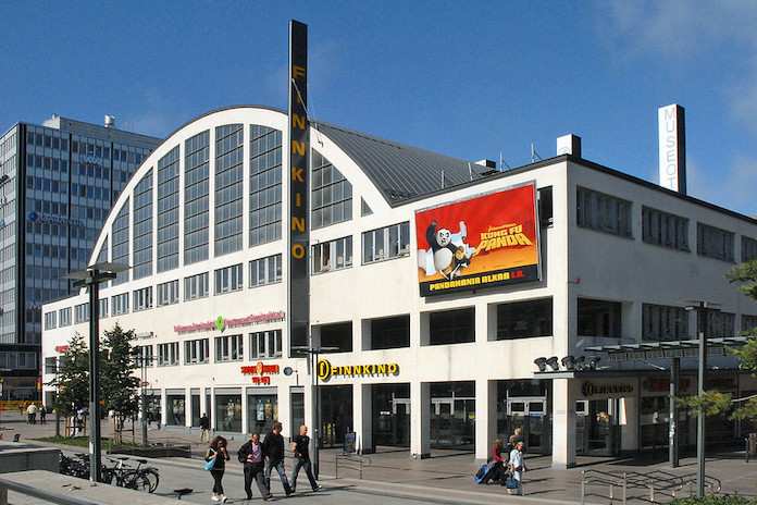
Tennispalatsi is a cultural and recreational complex designed by Helge Lundström, nestled in the vibrant district of Kamppi in Helsinki, Finland. Inside, you’ll now find a multiplex cinema, the esteemed Helsinki City Art Museum, the Museum of Cultures, and charming boutique shops. But its origins were more sport-oriented.
Putting the tennis in Tennispalatsi
If you’re wondering why Tennispalatsi is called that, you have to go back to 1938 when the building was constructed. Lundström built the functionalist structure for the 1940 Summer Olympics and it housed four tennis courts. Tokyo were the original host of the games but forfeited their right, with Helsinki due to step in.
They wouldn’t get to host it in the end as the 1940 Games were cancelled due to World War II. However, Helskini got a second chance in 1952 and Tennispalatsi was used for some preliminary basketball games. Talk about multi-purpose!
Tennis related: A Spotify playlist of songs about tennis
The Politics of Board Gaming Amongst Friends
The Politics of Board Gaming Amongst Friends

In 2012, Jay Cheel made a short film about playing board games with his friends over the course of a month. As the film goes on—and from what you can deduce from the thumbnail—things get heated. Having attended a 24 hour board game marathon a few weeks ago, I’ve seen glimpses of this so I get it.
Board game related: Carcassonne & Chill: A Medieval Board Game from Germany
Did you know that Phyllis Diller had her own canned chili? Phyllis Diller’s Philli Dilli Chili, based on her own recipe, debuted in 1987 in three varieties, beef, chicken and vegitarian (sic). The venture proved to be unsuccessful due to lack of good distribution and ceased production within just a few years.
Psychological disorders named after cities
You’ve heard of Stockholm Syndrome but there are more psychological disorders named after cities, according to Atlas Obscura:
Lima Syndrome is when the hostage takers start sympathizing with the hostages. And London Syndrome is when hostages become argumentative toward their captors—often with deadly results.
In all, ten cities around the world carry a unique burden: they have a psychological disorder named after them. In an old issue of Names, the journal of the American Name Society, Ernest Lawrence Abel listed and described them. He arranged them in three categories: four tourism-related, three linked to hostage situations, and three “other.”
Other cities include Jerusalem, Paris, Florence, and Venice.
Colored Andy Warhol Campbell’s Soup Skateboard Decks
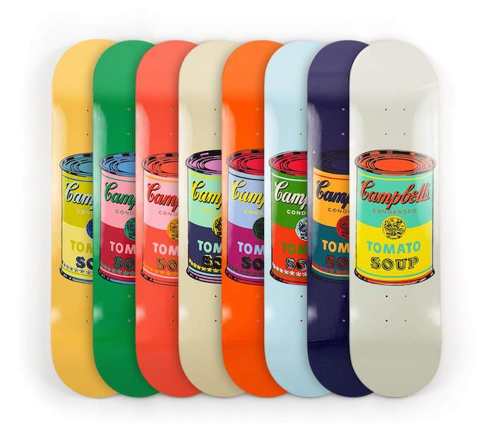
Andy Warhol’s Campbell Soup Cans are back, in skateboard form.
£1650 for all 8 decks.
More on decks: Clandestina skateboard designs by Oscar Maia and a Space jam skateboard that says Abolish I.C.E.
How the Porsche Crest could have looked
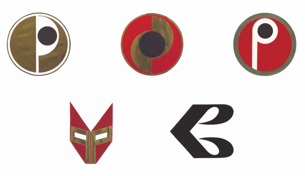
Porsche’s Newsroom looked back at the Porsche Crest and how it might have looked if it got changed from its current design:
It is an intricate work of art and unifies so much of what distinguishes Porsche. It’s also clear proof that projects undertaken with conviction and which come straight from the heart can make an impact, even in the absence of formal training. Porsche now had, with its crest, a logo that would make an impression – not only on the cars themselves, but on letterheads and in advertisements and publications. But it would also attract controversy.
First, to understand what a detailed logo with many colours signified, we need to wind the clock back. In the 1950s, colour printing was still very expensive, and also rather complicated. Not every printer had suitable machines, for example, nor was it easy to create printing plates, or to set registration marks with precision so that all the print forms were positioned exactly on top of each other. Creating a clear, sharp graphic or image without the print screen slipping was therefore tricky. Moreover, the Porsche crest didn’t look nearly as elegant as a stark black-and-white version. Porsche sales managers and the dealer organisation also saw another problem, which was addressed by writing to Porsche and its head of advertising, Hermann Lapper, in 1961: “The different colours and many details as a whole do not amount to a compact, coherent visual effect in road traffic.”
They wanted it to look different and enlisted the help of Hanns Lohrer to come up with some new logos (above) which were in stark contrast to the existing crest. He had already created some iconic posters and adverts for Porsche and while his ideas were interesting, they obviously didn’t make the cut. But it’s cool to see what might have been.
Chris Laing on optimising space and design for the deaf community: There are so many things – from poor lines of sight to acoustically hostile material palettes – that create problems for deaf people but which hearing architects would never consider and have never been asked to consider.
What if Tim Burton had made Batman Forever?
What Could Have Been: Tim Burton's Batman Forever

I’ve been binging Bullets & Blockbusters videos for the last few weeks and I’m a sucker for content about failed scripts/film ideas. This one is about what would have been “Batman III” the sequel to Batman Returns that eventually became Batman Forever.
The story is pretty well known amongst people who know about the original Batman trilogy but this video adds additional context to the whole debacle and just how much WB didn’t want Burton there. While there was animosity from his side, it doesn’t sound like Keaton (who was slated to return but later backed out) had any ill will towards Joel Schumacher; just creative differences without the innuendo.
We missed out on a lot and for the most part, I’m not mad about it. Keaton would have been cool to see again but I enjoyed Val Kilmer’s portrayal. I liked Jim Carrey as The Riddler and while it was kinda shitty that Robin Williams was used like that, I enjoyed Carrey’s incredibly camp performance. I’m sad about Billy Dee Williams not getting his role as Harvey Dent/Two-Face (which, in hindsight, would have really worked to get a Black actor in there as a “for the culture” nod to Schumacher’s The Wiz). Marlon Wayans as Robin? Can’t be any worse than Chris O’Donnell (no shade). Imagine two Black actors in the forefront (although having that Black-on-Black conflict might have upset some folks, I’m sure).
I didn’t expect to write so many of my own opinions here so enjoy the video and let me know what changes you would have made, kept in, or taken out of the final movie.
A visual history of Senator Kelly's brief mutant life in X-Men
Senator Kelly's Death Scene | X-Men (2000) Movie Clip HD 4K

I loved X-Men as a kid but my opinion of it (and the subsequent movies) haven’t aged well since. They were… of their time, shall we say. But one thing that continues to intrigue me is the story arc of Senator Robert Kelly getting transformed by Magneto’s Conversion Machine and becoming a mutant. Kinda. He was imprisoned at the time and managed to escape, with his power being able to take the form of water. But his mutation was unstable, the X-Men tried to help him and he dissolved/melted/passed away in Storm’s arms. Even if he was anti-mutant, I did feel kinda sorry for him.
Jen Glennon, for Inverse, looked at how this arc was all put together from a visual effects perspective:
“This was just an idea I had. Nobody knew if it was going to work,” Fink says. “This is what you do in visual effects quite often — you make up things that you’re absolutely confident you’re going to work, but you really have no idea because nobody’s ever done it before. So you’re always kind of standing with your fingers crossed behind your back when the director shows up.”
Dissolving Kelly also gave Fink and the visual effects team on X-Men the opportunity to break new ground with photogrammetry, which uses high-resolution photographs to construct 3D environment models. Consistent lighting across all elements of this sequence made it far easier for the compositor to seamlessly blend digital and practical effects in post-production.
The evolution of the Guinness harp, from 1759 to the present day. So glad it hasn’t fallen foul to hyper-minimalist design.
Paul Reubens (1952–2023)
Paul Reubens sadly passed away on Sunday 30th July at the age of 70 after a bout of cancer. He was best known for his iconic role as Pee-wee Herman as well as roles in Batman Returns (as Oswald Cobblepot/Penguin’s father), 30 Rock, The Blacklist, Pushing Daisies, and the voice of Bat-Mite in various DC Comics media.
Deleted scenes from The Fabulous Baker Boys
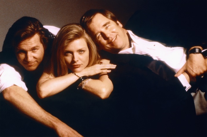
The Fabulous Baker Boys is my second favourite movie behind Batman Returns but despite having watched it a million times, I had no idea there were deleted scenes. Until today.
Unfortunately, I can’t embed the video of all three so you can watch them on YouTube.
- The first deleted scene shows a different and extended version of the brothers deciding to go with Susie Diamond. Notably, Jack has more dialogue when convincing his brother to go with Susie over the other auditionees.
- The second deleted scene shows the trio rehearsing ‘Can’t Take My Eyes Off You’ but Susie has trouble getting her voice heard over the brothers’ overpowering piano play.
- The final deleted scene shows the trio enter the King’s Manor, where they would be performing on New Year’s Eve, to “get to know the hotel”. Susie has an idea involving a “dramatic” lights-on introduction.