The Cinema Cartography created a video essay dedicated to Japanese cinema, featuring concepts such as bushidō, wabi-sabi, and mono no aware.
Cultrface – a blog dedicated to culture and how it enriches our lives.
That time a whale’s tail saved an empty metro train and its driver from crashing
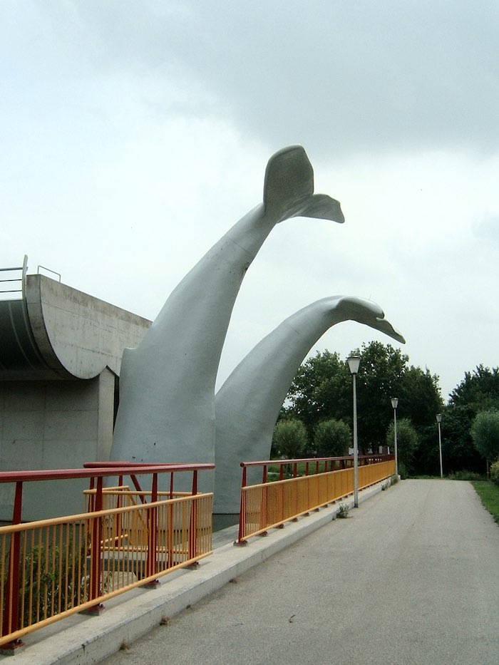
The story goes that in 2020, a metro train crashed through a buffer stop in Rotterdam and would have fallen 10 metres to the ground had it not been for a whale sculpture built on the sidings. The driver escaped unharmed and its sculptor Maarten Struijs, said he was surprised it held together.
Train related: a train moving at safer, much more glacial pace
(via Atlas Obscura)
Mighty Morphin Power Rangers is coming back. Netflix announced a new exclusive series titled “Once & Always”, in collaboration with Hasbro, to celebrate the 30th Anniversary of the Power Rangers. The series will also see a return of some of the original cast.
LEGO but filmed with a Laowa probe lens
Shooting LEGO with WEIRD camera lens

Ever wonder how people get up close shots of tiny objects and surroundings? They use a probe lens! Tiago Catarino used a Laowa probe lens to film the inside of some LEGO builds, offering a peak into the kind of constructions you wouldn’t normally see unless you were in a remake of Honey, I Shrunk the Kids.
If you fancy getting a probe lens yourself, prepare to fork out over £1,000.
LEGO related: A LEGO Van Gogh, Ekow Nimako’s Afrofuturistic LEGO® universes, Arndt Schlaudraff, the LEGO® brutalist, and that time someone made Frasier’s apartment with LEGO
Mount Nyiragongo

Mount Nyiragongo is a highly active stratovolcano in the Democratic Republic of Congo. Its last eruption occurred in May 2021, causing widespread damage and displacement of people living nearby. The lava from this volcano is known to flow at an exceptionally high speed, making it one of the most dangerous volcanoes on Earth. The volcano also produces lethal levels of carbon dioxide, known to locals as ‘mazuku‘, and acid rain which has poisoned the nearby village’s drinking water.
Despite its dangers, Mount Nyiragongo remains a popular tourist destination for adventurous travellers seeking thrills and hiking safaris (which I didn’t know was a thing until now).
Volcano related: Cumbre Vieja: an erupting volcano in 4K, NatGeo and social media on the Tonga eruption, and is it possible to stop a volcano?
Lamanna's Bakery and their humungous pizza slices
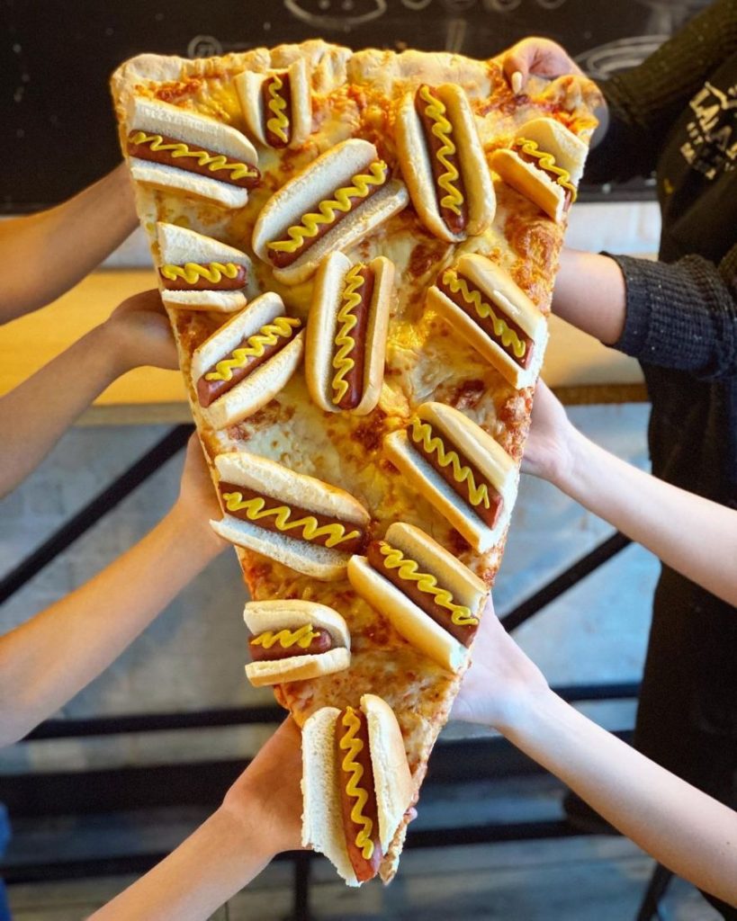
Lamanna’s Bakery is a family-owned and operated bakery located in Toronto, Canada. Opened in 2004, it’s known for its oversized slices of pizzas with the wildest toppings imaginable. I’m talking Nutella donuts and cannolis, pancakes and bacon, and slices of red velvet cake. Oh, and the slices go up to 3 feet long.
Pizza related: Liam Quigley’s NYC pizza slices, hyper-regional pizzas, and Jonpaul Douglass’s Pizza In The Wild
Casey Potter's case study on the Windows XP brand design

Between 1999–2001, Casey Potter worked for frog design as a senior designer, specialising in corporate identity, product development, and brand strategy. That meant he worked on Microsoft Windows XP’s branding (which was known as Windows 2002 Home at the time apparently).
With the product design in place, we turned our attention to the Windows logo. Its classic four-color arrangement of red, green, yellow, and blue tiles on a pixelated pennant was seen to represent both windows opening onto the world and flags of exploration and discovery. The Windows mark needed to maintain the brand equity it had accrued in its long history while expressing the evolution towards a more flexible, user-friendly brand. Our team developed a slate of fifty new logos, ranging from simple to radical alterations, the top three candidates were my designs so I was chosen to present them to Microsoft for selection. While recognizably a descendant of its predecessor, the reinvigorated logo is distinguished by its clean lines, energy, and movement – a bright, forward-looking emblem of the digital frontier.
I urge you to go to the case study page on his site and see the brand evolution because it’s truly fascinating. This was also the first time I’d hear of frog design (now just “frog”), which is wild because they’re kind of a big deal.
The Flash trailer (2023)
The Flash – Official Trailer

I’m a month late with a blog about the new Flash trailer (here’s my blog about the first teaser trailer) but I needed to express my interest beyond Twitter. I don’t care for Ezra Miller given their wild behaviour (to put it incredibly mildly) so I won’t be watching for them—it’s the return of Michael Keaton’s Batman that I’m interested in. And we finally get to see him in the flesh and here those immortal words:
I’m Batman.
But I’m also excited to see Kara Zor-El aka Supergirl (played by Sasha Calle) as it’s the first live action Supergirl film portrayal since Helen Slater’s Supergirl in 1984 and I like the non-blonde direction.
Morisawa Shin Go and the story of Japan's Helvetica
What's the deal with this font?

Nintendo Wii fans will recognise the font in the above video, known as Shin Go, but its use all over Japan is much more prevalent. T2norway delved into the font’s history and why it’s used so much. Shin Go was inspired by a typeface called Gora which was digitised and amended by both Fontworks (NewRodin) and Morisawa (ShinGo) who made their own versions, thus resulting in a lawsuit which ultimately went nowhere.
Font related: a visual and oddly political history of the Wingdings font and a study into the fonts used by the top 1,000 websites
Yvonne De Carlo
Yvonne De Carlo - Documentary

Yvonne De Carlo was a Canadian–American actress born on 1st September 1922 in Vancouver, British Columbia.
De Carlo’s career began in the early 1940s when she moved to Los Angeles and signed a contract with Paramount Pictures. Her first major film role was as Anna-Marie St. Clair in Salome Where She Danced. While the film was a critical disaster for producer Walter Wanger, it was a success for De Carlo and she signed a five-year contract with Universal Pictures.
Throughout the late ’40s and early ’50s, De Carlo continued to act in films such as Brute Force, Criss Cross, and The Ten Commandments.
However, it wasn’t until she landed her iconic role as Lily Munster on the TV sitcom The Munsters that she became a household name.
Nokia changed their logo and I wish hadn't
On Sunday, Nokia announced plans to change its branding for the first time in over half a century and that came with a new logo (above). The aim seems to be a shift away from its “association to smartphones” and more towards Nokia as a “business technology company,” (I’m paraphrasing the words of Chief Executive Pekka Lundmark in his interview with Reuters).
My verdict: I don’t like it. Regardless of the visual association, I think this logo and the overall branding will make them less distinct. It’s unimaginative and boring. It also speaks to a point I was making to myself (because I love a good self-rant) about how companies strip away their identity and, instead of coming up with something clever and memorable, they go with Yet Another Sans Serif Wordmark That No One Will Remember. If you want to be more accessible or reduce print costs by using less colours, fine, but there are plenty of other ways to go about it instead of crap like this.
The old logo will always be better and this new one will not help connect with people. Gain insights into your website’s performance using these online seo tools.
Logo related: Corporate logos but make them look bootleg with image AI, Los Angeles’ new tourism logo looks super cool, and where did Ruff & Mews go from Petco’s new logo?
The world's most expensive Rubik's cube
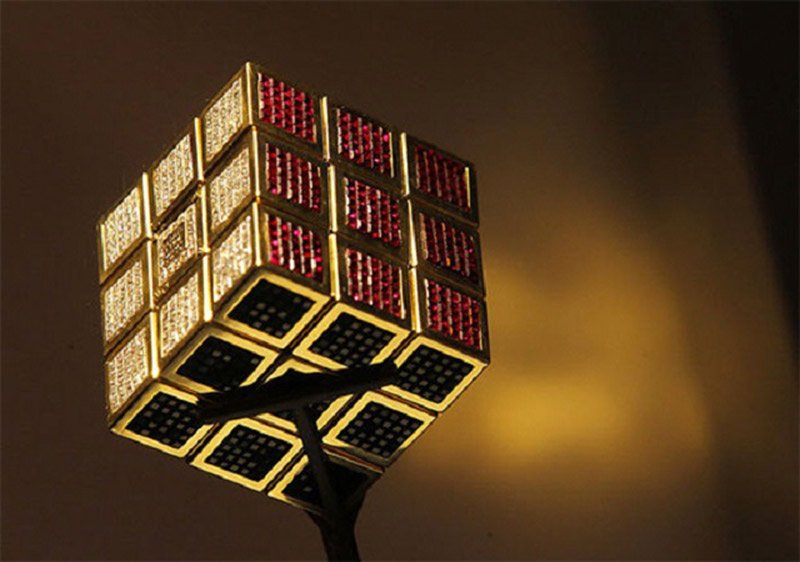
Created in 1995 by Diamond Cutters International, the Masterpiece Cube is the most expensive Rubik’s Cube in the world. It is worth around $2.5 million and was made to commemorate the 15th anniversary of the puzzle. As you can guess by the name of the company that crafted it, the Masterpiece Cube features a range of precious stones and jewels including emeralds, rubies, and amethyst, all set in 18-karat gold. However, we wouldn’t recommend trying to solve this Rubik’s cube as the stones may cut your hands. That’d be one expensive trip to the medicine cabinet.
Gold related: 12 objects unnecessarily covered in gold
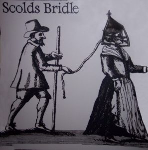
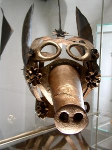
Masks of shame
Throughout history, people (mostly women) have been made to wear special masks as a punishment for their social behaviour. In England and Scotland, they were known as bridles or branks, while in Germany, they were known as schandmasken (or “masks of shame” in English).
The brank, or ‘scold’s bridle,’ originated around the early 17th century. Most early references date to the 1620’s or 30’s. It was used ‘To curb women’s tongues that talk so idle.’ The metal device passed over and round the head and was fastened at the back of the neck by a small padlock. The bridle-bit – a flat piece of iron, about two inches long and one inch broad, went into the mouth, and kept down the tongue by its pressure.
via National Education Network
In Germany, male and female commoners were at risk of wearing a schandmaske if they had the nerve to wear regalia of a higher class:
Commoners who dared to wear the symbols of the upper class were fined for their chutzpah. Restoring the social order, though, required more than a monetary payoff. The punishment for such a violation was public shaming, and in 17th-century Germany, as well as elsewhere in central Europe, England and Scotland, not much was more humiliating than the schandmaske, or shame mask.
Peacocking proletariats were sentenced to wear the rooster, a pounded metal schandmaske with a fleshy comb and wattle, elaborately wrought feathers and a long beak. “The masks were fashioned to be as eye-catching as possible,’ explains Markus Hirte, the managing director of the Medieval Crime Museum in the central German city of Rothenburg ob-der Tauber, which has one of the most extensive collections of shame masks in the world and one of the last roosters to survive to the 21st century. “Many even had bells or a trunk that whistled when the person wearing it would breathe just to garner attention.”
via Atlas Obscura
With age, comes Wisdom
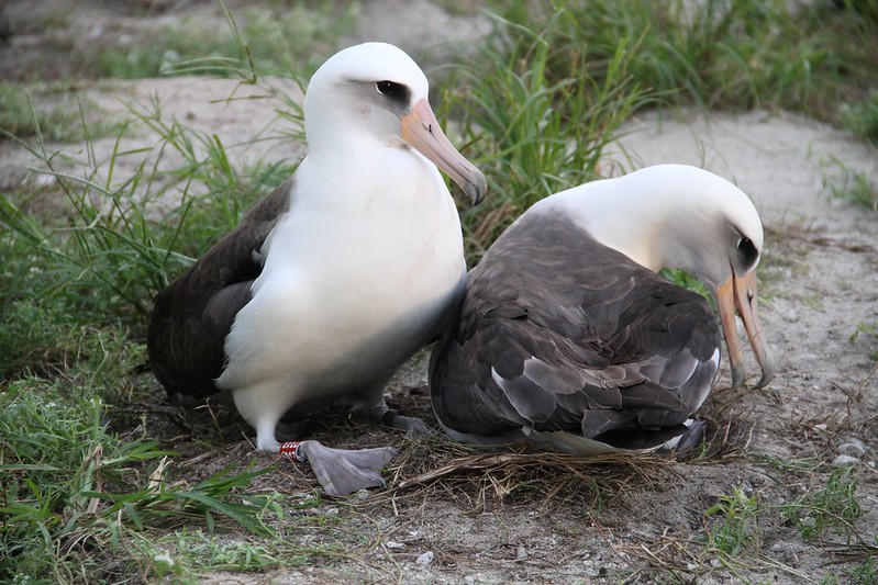
Wisdom the albatross is the oldest bird in the world at 72. It’s amazing to think that a single bird can live for that long, especially since all but 1 of the 22 species of albatrosses recognised by the IUCN are at some level of concern. (For further context, albatrosses tend to live up to the age of 40.)
Wisdom is a female Laysan albatross who nests in the North Pacific Ocean. She was likely born around 1951 (although she may have hatched before then) and was tagged in 1956, making her the oldest bird in the world. She’s also one of the oldest known breeding wild bird having laid healthy eggs as recently as 2021.
Bird related: The 13 birds of Christmas
Adopted Portuguese words in the Far East
I’ve previously covered Portuguese influences in the Far East with the castella, a cake (or “a bread from Castile”) introduced by Portuguese travellers which the Japanese turned into castella. But it runs much deeper than that from a linguistic perspective:
Len Leverson sent me his unpublished paper titled “O ‘pão’ Português Conquista o Mundo” about how the Portuguese word for bread spread across the globe. That got me to thinking about how many words of Portuguese origin are in Japanese. I’ll focus on “pão” more squarely in a moment, but first just a quick list of some important and interesting words of Portuguese origin in Japanese.
The first one that pops into my mind (for obvious reasons since I spent a couple of decades studying the mummies of Eastern Central Asia) is mīra ミイラ (“myrrh”) because, when the Portuguese were selling Egyptian mummies to the Japanese as medicine, they often mentioned myrrh as one of the preservatives, and the Japanese took the part for the whole.
Starting in 1543, the Portuguese were the first modern Europeans to visit Japan. Consequently, many words of Portuguese origin entered the Japanese vocabulary. Surprisingly, such a quintessentially Japanese dish as tempura derives from Portuguese (cf. tempero [“seasoning”]).
The Japanese word for “pants; trousers”) is a little bit more complicated. Portuguese jibão (“underwear”) led to Japanese juban / jiban (“underwear for kimonos”), but its cognate in French, jupon, led to zubon in Japanese.
Likewise, kappa (“raincoat”) derives from Portuguese capa (nowadays yielding to reinkōto).
via Language Log
I guess that’s one way to spread romance (geddit?!)